
Fermob transforms color into a science of emotion, durability, and design leadership, from trend analysis to powder coating.
For over three decades, Fermob has been more than a furniture brand — it has been a color laboratory, a company that dares to think beyond green and white to redefine what outdoor (and now indoor) design can be. Architects and designers around the world look to Fermob not only for products but for the chromatic stories those products tell.
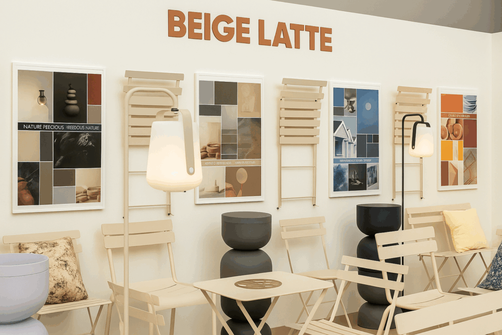
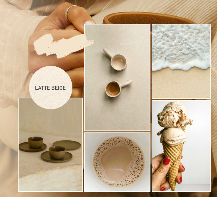
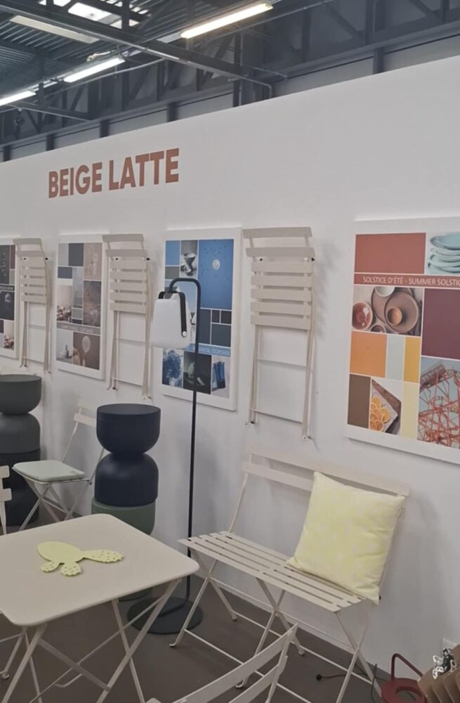
During our recent visit to La Maison Fermob and the Thoissey factory, we explored how the brand develops and applies its colors. From trend analysis and shade creation to the precise chain of painting production, Fermob has honed a unique expertise. This season’s new shade, Beige Latte, illustrates the process — a tone that bridges indoor and outdoor, calm and bold, simple and complex.
How Fermob Creates a New Color
The journey of every new Fermob shade begins with a deep dive into trends, although this mostly boils down to intuition. The brand’s team examines cultural, social, and design tendencies, then maps its 25-color palette against them. The goal: identify the “missing shade” that can complete or refresh a narrative.
Past years have seen bold, expressive tones — Blue Maïa, Orange Confit, Cacao, Pesto, Gingerbread, Marshmallow — colors with strong personality. In contrast, Beige Latte was selected to be a softer, more linking shade, versatile enough to harmonize with vibrant hues or earthy palettes.
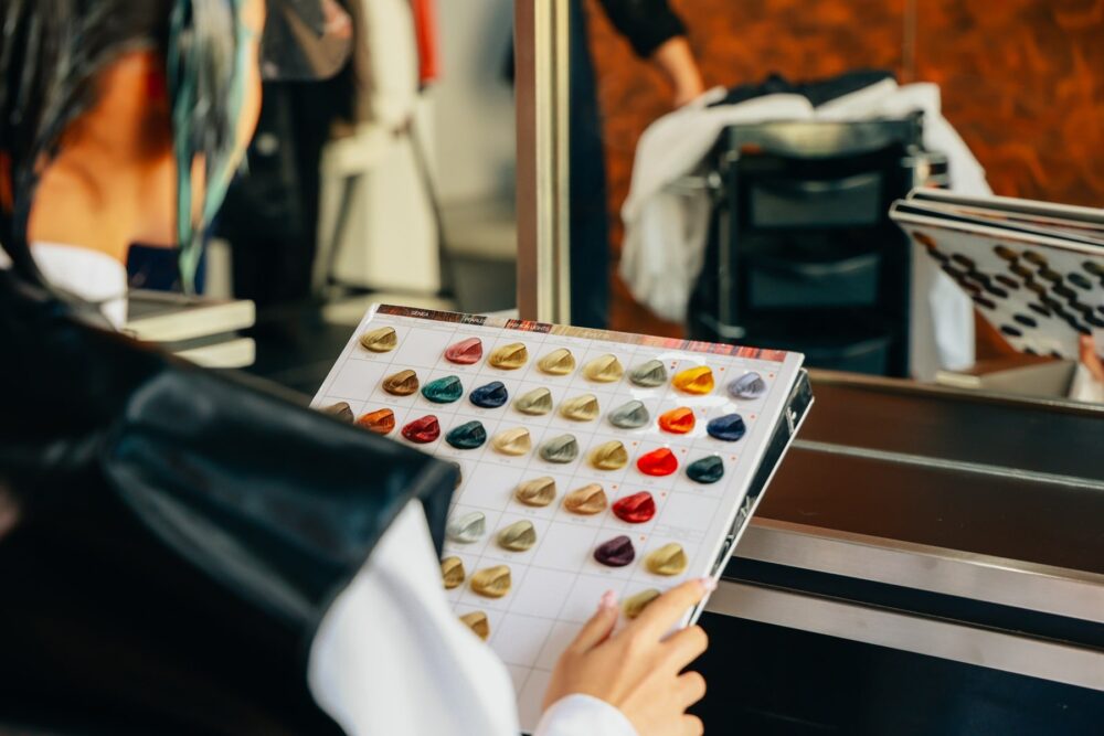
Color creation at Fermob also involves mixing and fine-tuning pigments. Laboratory teams test combinations not only for visual impact but also for durability, UV resistance, and harmony across materials. This rigorous process ensures that once a shade is added to the palette, it can live for years without fading or losing relevance.
The brand rarely launches a shade alone unless it is truly timeless. More daring tones are introduced in groups, encouraging designers and clients to play with associations. Beige Latte is one of those rare exceptions — a neutral with enough strength to stand alone.
READ more about the new Beige Latte in our article “La Maison Fermob: A Living Showcase of Color, Design, and French Art de Vivre.”
Technical Takeaways: Typologies, Tone Value, and Mixing Colors
Florimond stressed that whether a new shade will become a long-term business winner depends heavily on its typology — i.e., what category of color it is. Some typologies, notably greens in Fermob’s case, are “essential” and reliably sell; others are more pointed, trend-led, and therefore riskier. Choose typology first, then deployment strategy.
The tonal value matters more than hue alone. Florimond repeatedly explains that two colors that share the same tonal value (similar luminance/value or perceived lightness) sit together naturally; the brain often reads them as part of the same family. When two colors are on the same tonal plane, removing chroma (i.e., seeing them in grayscale) shows they have the same value, which explains why they harmonize. This is a crucial, practical rule for pairing: match or intentionally contrast tonal values depending on whether you want blending or tension.
Fermob thinks in roles: linking shades (like Beige Latte) that temper, neutralize, or bridge palettes; dominant shades that anchor a scheme; and re-awakening accents that “wake” the combination and create emotional impact. Florimond described examples where a marshmallow/pastel tone is used to “wake” a set of earthier shades, or where a small, high-impact accent (a “piment” / spicy tone) is introduced to create the coup de coeur.
“When you add a ‘waking’ color, that’s when you generate love at first sight. That’s how you create emotion — color is emotion.”
Fermob rarely launches a “pointy” or risky shade by itself. It releases sets so customers can immediately see the intended associations. That means when you specify, think in small palettes (2–4 tones) rather than single colors. For architects, this accelerates client acceptance: the brain already sees the composition.

The Emotion of Color and Client Adoption
At Fermob, the team sees shades as triggers of desire and conversation, creating either immediate attraction or rejection — but always a reaction.
“Color, sometimes it creates love at first sight, sometimes rejection, but always a reaction. And that is essential,” Aude Florimond said.
This emotional dimension is also strategic. In previous years, colors like Pesto and Gingerbread became more powerful when paired with Marshmallow, creating an unexpected yet instinctive harmony that captivated clients. The lesson: certain shades generate impact not alone but through dialogue with others.
For architects and designers, this means Fermob’s palette is not a static offering but a toolkit for creating atmospheres. Whether the goal is to calm, energize, or surprise, the combinations are designed to generate the “coup de cœur” — that spark of instant connection.
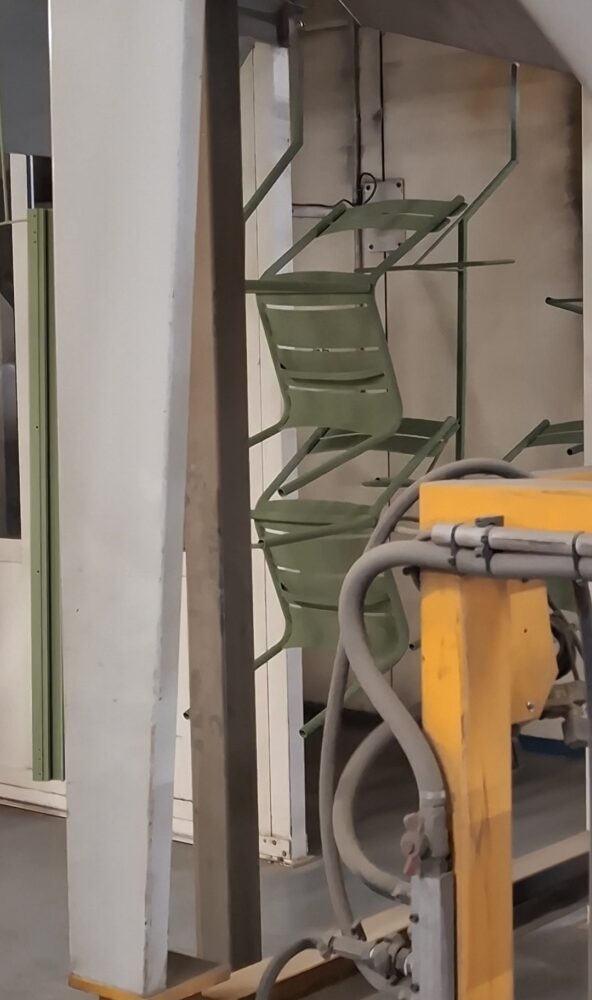
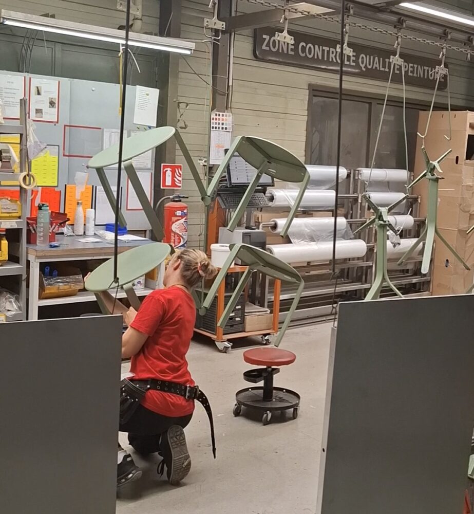
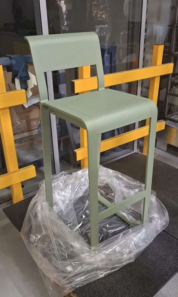
From Palette to Product – The Factory Process
The second half of Fermob’s expertise lies in translating colors from concept to durable, real-world products. At the Thoissey factory, guided by site manager Simon Piguet during a press tour, we followed the chain of painting production — a meticulous process that ensures every piece carries color as brilliantly as it was conceived.
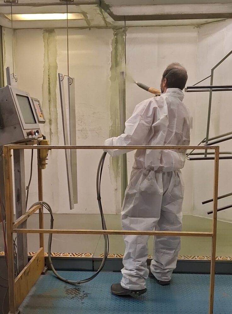
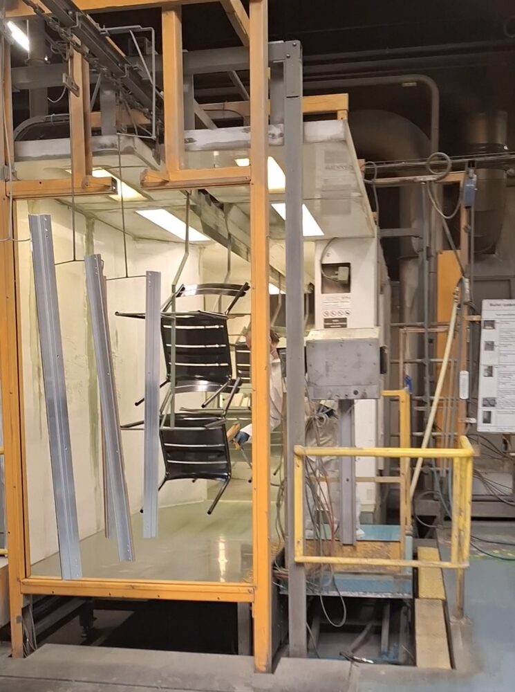
The stages include:
- Surface preparation — Sandblasting and cleaning each metal piece to create an ideal surface for adhesion. Anti-corrosion treatments are applied to guarantee longevity.
- Powder coating — Application of solvent-free, zero-waste powder paint. Excess powder is recovered and reused, making the process both efficient and environmentally responsible.
- Curing — Pieces pass through high-temperature ovens, where the powder melts and fuses into a uniform, ultra-resistant coating.
- Quality checks — Every item is inspected for consistency, ensuring a perfect match across batches — essential for large-scale projects like hotel terraces or public spaces.
“Every chair, every table passes through the same meticulous stages — from surface prep to powder coating to curing. That’s how we guarantee not only color brilliance but also its durability outdoors,” Simon Piguet said.
READ an article published by our sister media outlet DirectIndustry e-Magazine, “Inside the Factory | In Fermob’s Thoissey Workshops, Steel Bows to Design.”
Painting Workflow to Minimize Waste
Once metal surfaces are treated with anti-corrosion protection and prepared for adhesion, the painting process follows a highly structured workflow designed to optimize both quality and efficiency. Orders are grouped according to color, allowing batches of furniture in the same shade to be painted in one rotation. This ensures consistency across large volumes while minimizing waste in both time and material.
“If necessary, a piece can go through a second round, but never more than that — beyond two layers, the paint risks losing its quality and durability.”
For design professionals, this industrial choreography means confidence in specifying Fermob products for long-term projects. The color you choose is not only expressive but also engineered to last.
This precision allows Fermob to offer colors that stay true under sun, rain, and time. It is this industrial mastery that makes Fermob a trusted partner in demanding projects worldwide. Its leadership in color is the result of three interconnected strengths: the creative intuition to identify meaningful shades, the emotional intelligence to design palettes that resonate, and the industrial expertise to apply them with durability.
With Beige Latte, Fermob once again demonstrates how a single color can bridge worlds — indoors and outdoors, classic and contemporary. For architects and designers, the lesson is clear: color, when crafted with vision and rigor, becomes more than a surface.
It becomes an experience.