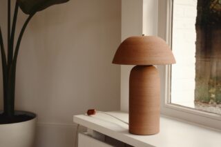

It’s always exciting when Benjamin Moore’s color of the year is announced. This year’s Shadow 2117-30 engenders a romantic, somewhat silky and quietly stormy mood. That’s what color is good for—creating moods. Colors are known to affect one’s emotional state, and Benjamin Moore’s mood producers have two new brands on the shelves to play with another sense: tactility.
Ultra Spec SCU FF-X is an easy-to-apply, scrape- and scratch-resistant paint perfect for high-traffic areas. On the other hand, Century has a luxurious character with a matte surface that feels like leather to the touch. During a recent panel at NeoCon 2017, the company discussed how bringing back the touch factor evokes the hand that crafts. Using the metaphor of the artisan, Century color sample cards are printed as the brush stroke of a painter, rather than a color block. In addition, samples are sold in glass jars (instead of tins) that recall cosmetic creams or potions.
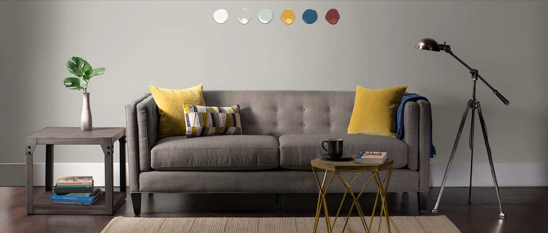
Century nods to the craftsman while using names that echo the Renaissance. In line with this revolutionary time period and a sensual relation to artistry, the paint lends itself to bold and dark colors, which is a surprise for some. But why this current trend toward rich colors? And why are people suddenly so daring?
“Due to a revolution in lighting, homeowners and designers are thinking about [[color and light]] in relation to each other. Now people can start to visualize spaces using applications like Pinterest. This makes it easier to embark on new projects,” a panel of experts said during the NeoCon presentation of Century.
Courtesy of Benjamin Moore.