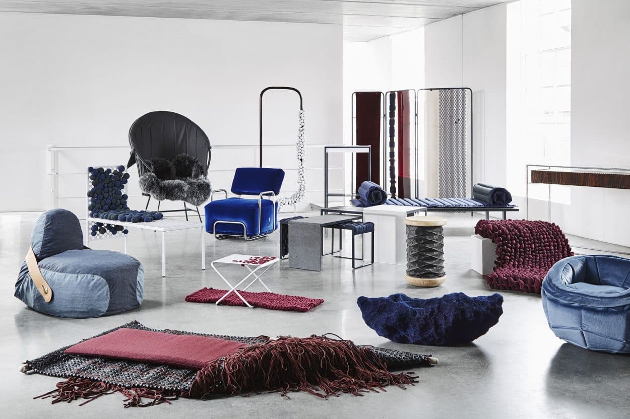
On the second to last day of IMM 2017, German architect Wibke Schaeffer, whose practice Lichte Arte works often with hospitals, physiotherapists and pediatricians, gave a talk on the psychology of color: what it says, why it matters and how we can best use it to our advantage.
“Color has a tremendous influence on our mood; it’s a purely emotional theme. And an intuitive one. Most people can’t immediately put their finger on why one color makes them feel different from another,” says Schaeffer, but research shows that it does.
Soup in a red pot tastes spicier than soup in a green one; pharmaceutical companies make pills red because we think they are more powerful than white ones; black boxes feel heavier than white or green ones. According to Schaeffer, there are 24 million known colors.
“I can’t wrap my head around that.” Green is not just green. It is a signal to others about what you like and how you would like to be perceived. Color is who you are. Designers who actively use color psychology in their practice help clients make sure their message is clear.
In previous centuries, color meant luxury. Pigment for clothing and paint was extremely expensive and really only available to royalty and their pals in the landed gentry. Even now, deep, rich pigments, like the ones used in formal dining rooms or family-run five-star hotels, still telegraph decadence.
Newton first wrote about the optics of color—how it is perceived mechanically by the eye—in 1704, but it was Goethe in 1810 that first explored the idea of how it was processed by the mind. In his book, The Theory of Colour, he introduced the color wheel and noted the attendant aesthetic qualities. To him, red and orange were rational; yellow and green, intellectual; green and blue, sensual and purple and red, fantasy.
Making a Stand for Personal Characteristics

Interior Design Spotlight: Sam Jacob designs Peckham hair salon where clients look at artwork instead of themselves
Two hundred years later, our common understanding is that there are five main elements of color: red (warmth, fire), blue (emotional, introverted), green (regenerative), beige/brown (earthy and rich), white (pure, clean, metallic). “These five elements stand for certain personal characteristics,” says Schaeffer.
The classic example, deep blue, is a favorite for corporations that want to project an image of competence and stability—think of Ford, Samsung, HP, Deutsche Bank and Pfizer. Light blue is the color of deep relaxation. The philosopher and poet Goethe said:
“Yellow is a light which has been dampened by darkness; Blue is a darkness weakened by light.”
Yellow also makes you hungry. In her take, Schaeffer told a story about working with an old folks home.
“They were wondering what color they could paint the dining room. When people get older they lose their appetite, and staff wanted to encourage the residents to eat more. The dining room had blue wallpaper, nice and calm, but in color psychology, it turns out that blue makes food taste bad. It reminds us of mold, which is why blue food, with the exception of Smurf ice cream, is not appetizing.”
Schaeffer painted the room yellow and dinner consumption improved.

Interior Design Spotlight: Bright colors in the dining area at hotel Joke Astotel to open the appetite.
Red stands out. This much is obvious. But what may be less so is how it can influence our perception. Schaeffer illustrated her point with a study done with boxers. Judges were told they had to review a fight to see who won on points. The boxers’ shorts were digitally altered between blue and red and in all cases, the boxer in the red shorts was declared the winner.
“I don’t know much about football but Bayern München (the richest and most dominant team in the German football league) wears red,” she said.
If a red room raises your blood pressure, a green one brings it down. In her work with doctors, Schaeffer has painted many waiting rooms green to help anxious parents and children relax a little.

Interior Design Spotlight: Feeling relaxed at the workspace and lobby for a TV production company in Bangkok by Anonymstudio
An Exception to the Rule
“Putting things in discrete categories is difficult for me, I’ve been in this business a long time and there are always exceptions,” she said. Over time, our perception of color also changes. The most famous example is blue for boys and pink for girls. It may seem impossible to imagine if your house is currently a hostage of the princess industrial complex, but up until the Second World War, it was the other way round. Says Schaeffer, “in Germany, prisons are often painted baby pink to help reduce inmate aggression.” Orange is the New Black set in Candyland would be another show altogether.
Despite this blue/pink flip flop, the psychology of color remains the same throughout the world. There are national stereotypes, of course: Germans embrace color on the outside of the house but allergic to rich color inside; Scandinavians prefer light and clean, Southern Europeans and South Americans splash bold colors about with abandon and every British house is full of rich color and dark wood. But this is largely because they wish to signal different things, not that Norwegians find duck egg blue to be as stimulating as the azure you might find in a Greek village. Even ancient systems of understanding color—Chinese and Hindu and Greek—come to the same conclusion.
Which is not to say we will ever fully agree. Color is too emotional for that. Case in point: One of the last things Wittgenstein did before he died in 1950 wrote a book about how Goethe got color wrong.


